Home|
Design
Help|
Your site may function beautifully 'under the bonnet' but poor graphic design can cause your clients to go elsewhere. On this page we're going to look at what makes a well designed web page.
The following links are connected to alternative style-sheets. In both versions only a couple of changes have been made to the original stylesheet.
Note: this style-sheet 'switcher' won't function in all browsers. For this reason we don't usually include this function in our web sites. We're using it here to show you how easy it is to alter the appearance of a page, just by making a couple of changes to a text file. For more details scroll down to the next section.
As this is an accessible site we've provided an alternative in case clicking on the links didn't work:
This site uses style-sheets (CSS*)| to determine page elements such as layout, colour and text-size.
A style sheet is a text file that's linked to all the pages on your web site. By making a change in the style-sheet eg, 'change text-colour to red', every page in the site will be updated and all the text will be in red.
This has a number of advantages:
- it allows the look of your site to be
changed very quickly, and
- it reduces the download
size of your pages by consigning all formatting code to a single file, instead
of having to write it to for every occurrence of an item on each and every page.
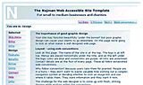
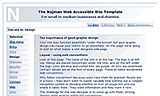
Look at this page. The name of the site is at the top. The logo is at left top. Menus are placed horizontally under the title, and on the left under the logo. Links are blue and visited links are purple. All links are underlined. Contact details are at the foot of every page. These all follow established web conventions.
Why follow convention? Because users take them for granted. People are in a hurry - they don't want to waste valuable time working out a complex navigation system or deciding whether to click an image-link and see where it takes them. They want information and they want it now.
The challenge for the web designer is to come up with fresh, striking designs while working within the conventions.
This site uses liquid design. Whatever screen resolution you're viewing this site on, from around 600-1600 px wide, the content will take up the available screen space.
See for yourself: put your cursor on the lower-right hand corner of the browser, then click and drag towardes the top-left corner. Page elements will start to move towards the left of the browser. If the space gets too constricted elements will start to drop below each other.
Liquid design requires a way of thinking specifically related to the web. There is no one 'fixed' design view.
We test your pages at four different screen to height ratios, then test again to make sure that they still work between these ranges. Who knows if your client has an extra toolbar on the left (eg 'favorites') which chops off an extra 300 pixels?
Using a liquid design for your website means you can rest assured that your page will be delivering its message no matter what the screen size your customers are using.
The colour scheme you use on your site can make or break it. It has a lot of work to do:
Colour has an immediate effect - the first impressions your site evokes in the viewer count - garish or dissonant colour schemes can lose you business straightaway.
If you've decided to extend your marketing strategy to include a web site, colours from your existing identity should be chosen as the basis for the site colour scheme.
Tonal contrast is all important. You might have a beautiful colour scheme but users might not be able to read the text because eg, your green text is too close in tone to the blue background.
Also you have to bear in mind that a significant percentage of your users suffer from some form of colour blindness. The following images compare a standard view of this page with how it would look to a user with a common (Protanope) form of colour blindness:
As you can see from the second image (Protanope) a large amount of the blue has been stripped away. However, because this site has been designed with this possibility in mind, the page is still completely readable. In fact, we build all our sites in monochrome first to make sure the tonal contrast is excellent. Only then do we add the colour.
This site uses Verdana, a widely supported web font. If your browser doesn't carry Verdana, then Arial will replace it, another standard font. Failing that, you will see this page rendered in Helvetica (if you're using a Macintosh computer) or Sans-serif, a generic font, if you're on a PC. All these fonts were designed especially for the web, so they all render well.
One of the limitations of the web is it's poor support of fonts. You might design your site using a very elegant font (Centurion comes to mind) and find, when you view it on a visit to an important client, that it's not on their machine and your site looks radically different. That's okay if only a few people lack the font - but there are millions of people out there and the statistics show that standard fonts are the solution if you want to feel easy in the knowledge that what you see is what your customer sees. This is a sound argument for sticking to the basic fonts.
Note: as a way round this many designers make images of text so they can use particular fonts. This is not a good solution - your client may have images turned off, in which case they will see absolutely nothing. Also, using images of text instead of 'straight' text not only significantly increases the download time of your pages, but makes it impossible for search engines to search the page content and assign it a ranking in their listings.
Short for Cascading Style Sheets, a feature that gives more control over how pages are displayed. With CSS, designers can create style sheets that define how different elements, such as headers and links, appear. These style sheets can then be applied to any web page.
A programming language for use in web pages that allows the use of dynamic (interactive) content. It is dependent on users having the javascript compiler turned on. For this reason it is recommended that you keep javascript to a minimum on your site, and always provide an alternative means of carrying out the function it performs.
To view a range of projects browse the Najman Web portfolio |on our main site.
©Najman Web 2004